

Project 4 for GA-DC User Experience Design Immersive Course.
This project was really an extended "Hackathon". We had one week to present a digital prototype of an interactive application. We were teamed with a group of Web Development students who would be coding what we designed. The idea was to ideate an interactive concept from scratch, and then see how far it could be brought, both from a UX as well as a web development perspective in several days.
This project was really an extended "Hackathon". We had one week to present a digital prototype of an interactive application. We were teamed with a group of Web Development students who would be coding what we designed. The idea was to ideate an interactive concept from scratch, and then see how far it could be brought, both from a UX as well as a web development perspective in several days.
Preliminary Discussions
Our first meeting on Day1 of the project consisted of the team discussing what the direction of the interactive would be. Fortunately for us, one suggestion, by one of the developers, was quickly recognized as a mutually interesting and challenging seed of a potential application.
Our first meeting on Day1 of the project consisted of the team discussing what the direction of the interactive would be. Fortunately for us, one suggestion, by one of the developers, was quickly recognized as a mutually interesting and challenging seed of a potential application.
The suggestion centered around the idea of developing an application allowing individuals interested in a tech career to:
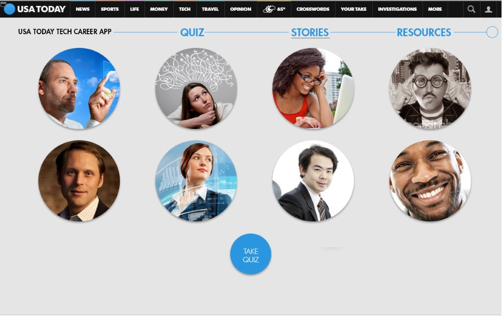
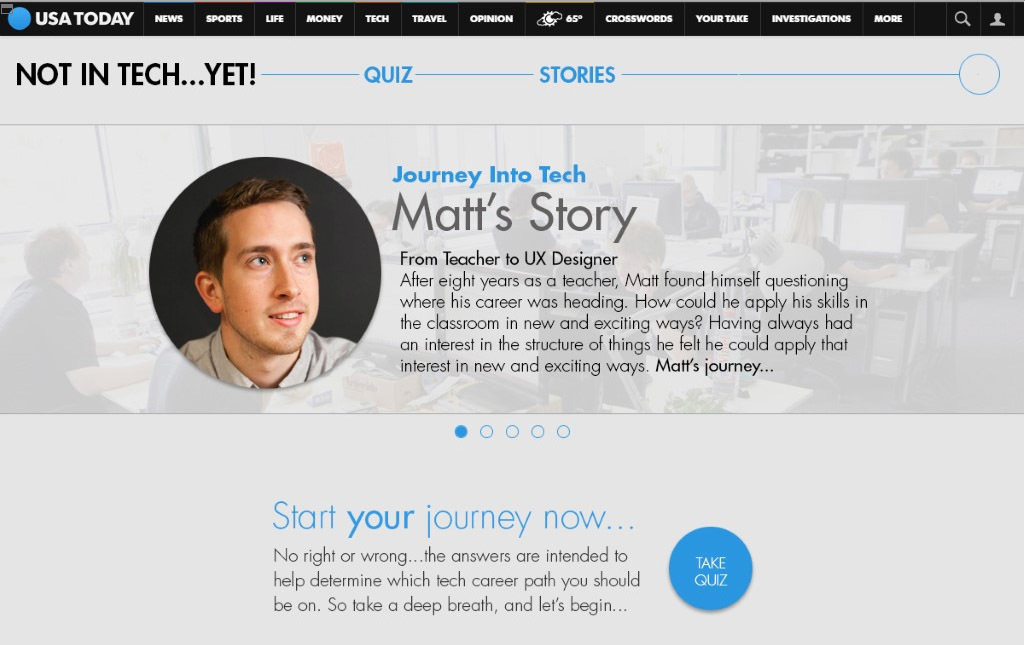
(a) read stories of people who had made the move into a tech career. The idea was that seeing people actually
making the move would be a strong motivator for those considering such a step.
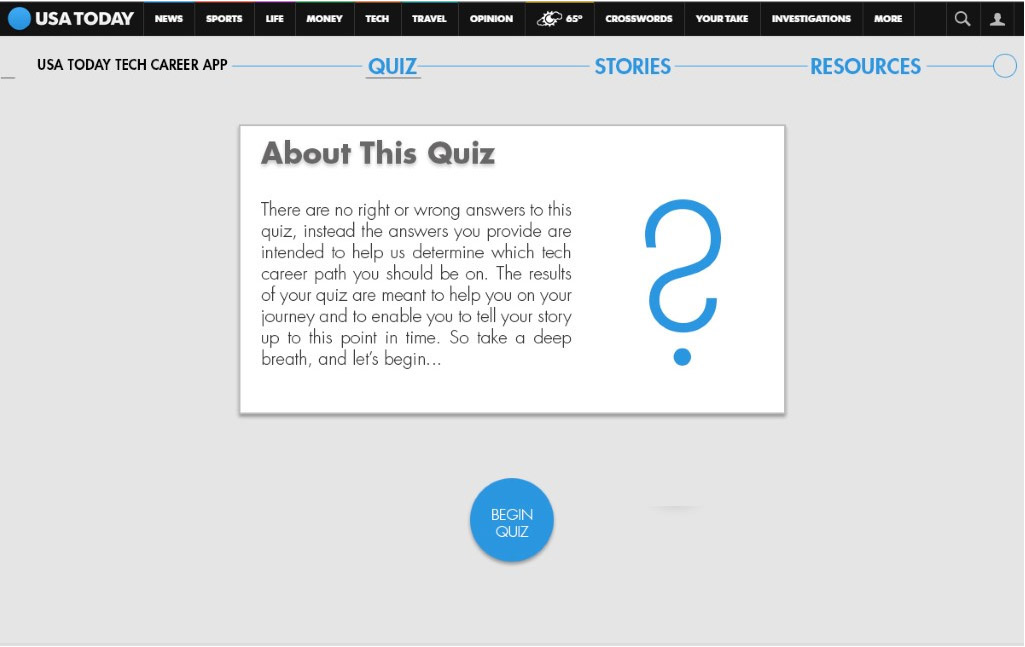
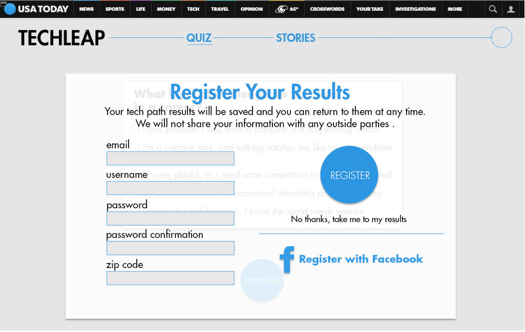
(b) take a quiz that would then allow the application to then return various curated content that would help each
individual determine what tech path to follow.
(a) read stories of people who had made the move into a tech career. The idea was that seeing people actually
making the move would be a strong motivator for those considering such a step.
(b) take a quiz that would then allow the application to then return various curated content that would help each
individual determine what tech path to follow.
Early Feedback From Client
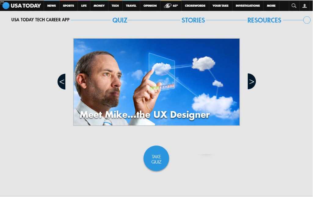
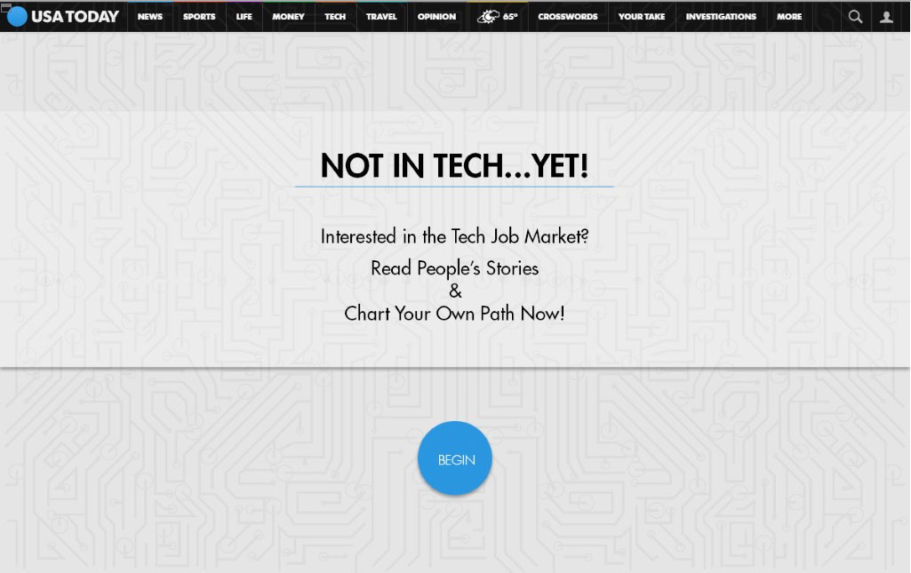
The USA Today representatives were walking around during our early brainstorming sessions. They offered some good advice.The first suggestion to us was to “Write a Headline First.” They reminded us that we were trying to bring storytelling to interactive. By concentrating on the headline, it would give us the basis for structuring our approach. Our initial headline became "Not in Tech...YET!"
The idea behind this headline was based on something we had learned in class about the “growth mindest”. It had to do with the thought that when you are in that mindset, everything is an opportunity for growth. Goals not achieved are simply goals not achieved YET.
The second suggestion was “be cautious of doing too much. What is the least it can be, because you can always add on later.”
Based on that feedback, we quickly revisted our plans and, as a group, came up with our MVP, or Minimal Viable Product. It was decided that we would buid the:
(1) quiz, whose results would help determine a user’s tech career path and what information the application would
provide to the user in terms of tools and resources,
provide to the user in terms of tools and resources,
(2) stories page, where users could be motivated by the journeys of those who came before them.
User Research
As noted earlier, the limited timeframe of the project and even more limited timeframe on having the group together made user research difficult. We decided that all of us, as students transitioning into a tech field, were potential users of our application, and we tried to develop User Personas using our own experiences. We came up with three distinct personas.

User Stories and Journeys
At this juncture, we began discussing what our application might begin to look like. We had decided on the overall content buckets, but were still unsure of exactly how to structure the site. One thing we were sure of was that the quiz would be the tool which would be used in guiding feedback to the user. The users’ answers to the quiz questions would trigger the feedback they needed to continue on their journey.
We started to break down the quiz and quickly determined that for this short-term project, we might have to make a decision to limit our quiz outcomes to job categories instead of specific jobs due to time constraints.

It was at this point we decided to further flesh out the structure of the site, so that the developers could then make the decision as to how much of the design they would then be able to code, given the time remaining. In an effort to do so, we decided to take several of the personas and map how they might use the application.


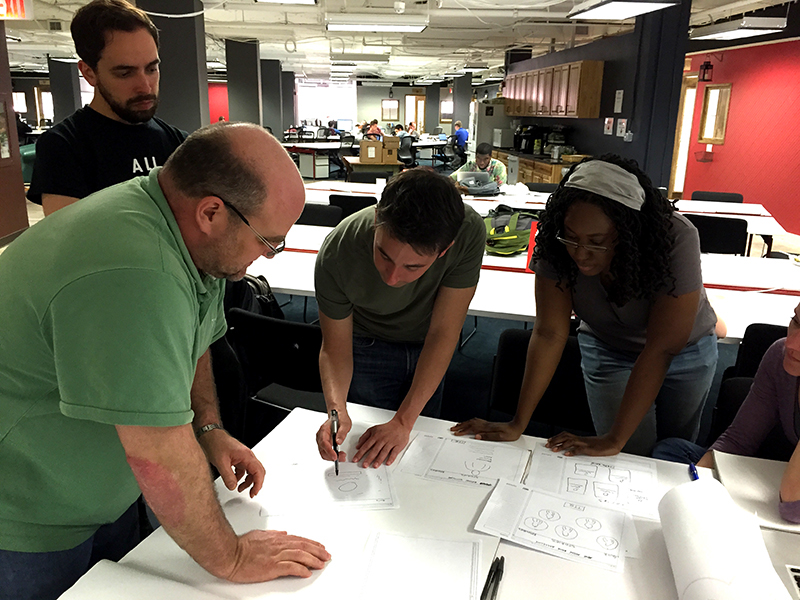
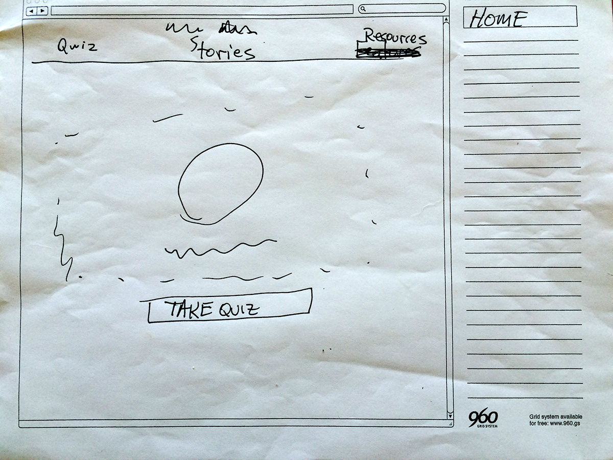
Rough Sketches
Once we figured out the basic structure of the pages we wanted to develop, it became imperative that we sketch out rough ideas of the pages themselves. This was the point at which we wanted to give the developers a chance to get coding while we continued to solidify the content and look and feel of each page.
Once we figured out the basic structure of the pages we wanted to develop, it became imperative that we sketch out rough ideas of the pages themselves. This was the point at which we wanted to give the developers a chance to get coding while we continued to solidify the content and look and feel of each page.

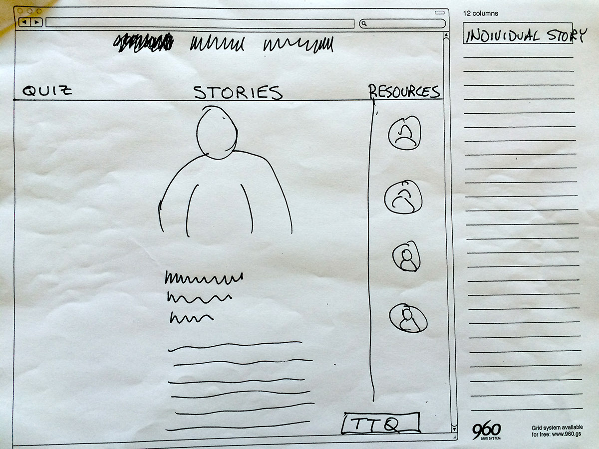


Preliminary Digital Prototype
At this point in the process, the developers broke away from the UX designers, and started developing off of the initial sketches that we had worked on. In an effort to further provide them with a better framework with which to work, I took the sketches into Axure and began making wireframes that would give them a better idea of the content on each page.
At this point in the process, the developers broke away from the UX designers, and started developing off of the initial sketches that we had worked on. In an effort to further provide them with a better framework with which to work, I took the sketches into Axure and began making wireframes that would give them a better idea of the content on each page.


Second Digital Prototype
As we began to think about further developing the details of each page, as well as midifications based on user input, I decided to use Photoshop to bring certain USA Today elements into the working prototypes. Most of the subsequent prototype work was done in this tool and then imported into Axure to show the links between and among the pages and other states.
As we began to think about further developing the details of each page, as well as midifications based on user input, I decided to use Photoshop to bring certain USA Today elements into the working prototypes. Most of the subsequent prototype work was done in this tool and then imported into Axure to show the links between and among the pages and other states.
Using this tool proved to be beneficial in terms of trying to make the prototypes look as close to the finished product as possible.


Additional Digital Prototype Iterations
As we continued to do user testing of our prototype, we were presented with an ever changing list of alterations which we then worked into the prototypes and would then restest. In the meantime, the evolving look and feel of the prototype was continuously being provided to the developers, so that they would have the opportunity to institute the changes they had the time to make.
As we continued to do user testing of our prototype, we were presented with an ever changing list of alterations which we then worked into the prototypes and would then restest. In the meantime, the evolving look and feel of the prototype was continuously being provided to the developers, so that they would have the opportunity to institute the changes they had the time to make.


Final Prototype
By the fourth day, we had arrived at our final prototype, or at least the one we would present to the USA Today review team. The development team foud it very helpful to be continuously supplied with our revised prototypes, because it allowed them to build out several of the pages to look very similar to what we had envisioned.
By the fourth day, we had arrived at our final prototype, or at least the one we would present to the USA Today review team. The development team foud it very helpful to be continuously supplied with our revised prototypes, because it allowed them to build out several of the pages to look very similar to what we had envisioned.


Online Prototype
If you are interested, you can see the final UX Prototype here:


